Pro Tips
3 UX Mistakes in Category Navigation That Hurt Conversions
May 10, 2025
Category structure is the backbone of any eCommerce experience. But when it's overcomplicated or inconsistent, it silently kills conversions. Here are 3 UX issues to avoid if you want to guide users—not lose them.
🚧 1. Too Many Subcategories
When the main category leads to 5+ sub-levels, users get confused, overwhelmed, and drop off.
✱ Keep it simple. 2–3 levels deep is usually enough for most catalogs.
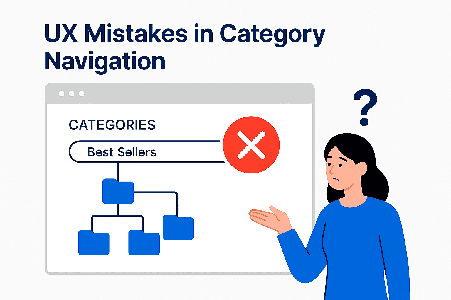
❌ 2. “Everything” Tabs
Generic tabs like “All Products” or “Best Sellers” don’t help users understand what they’re viewing. They add ambiguity, not clarity.
✱ Replace with meaningful labels that reflect user intent (e.g., “By Skin Type”, “Office Essentials”).
🧭 3. Unpredictable Flows
When category pages change layout, filters, or product order based on promos or stock — without explanation — trust is lost.
✱ Consistency builds user confidence. Use announcements or badges to explain major shifts.
✅ Fix It:
Use clear filters and breadcrumbs
Maintain naming consistency across all categories
Audit UX quarterly using actual navigation data
🚀 Want a Pro UX Audit of Your Store?
I offer expert category audits, UX flow optimization, and eCommerce conversion strategy.